Why a Balanced Layout Is Like a Perfect Sigil (Pentagramified Blog Series)

The Hidden Magic of Design Balance
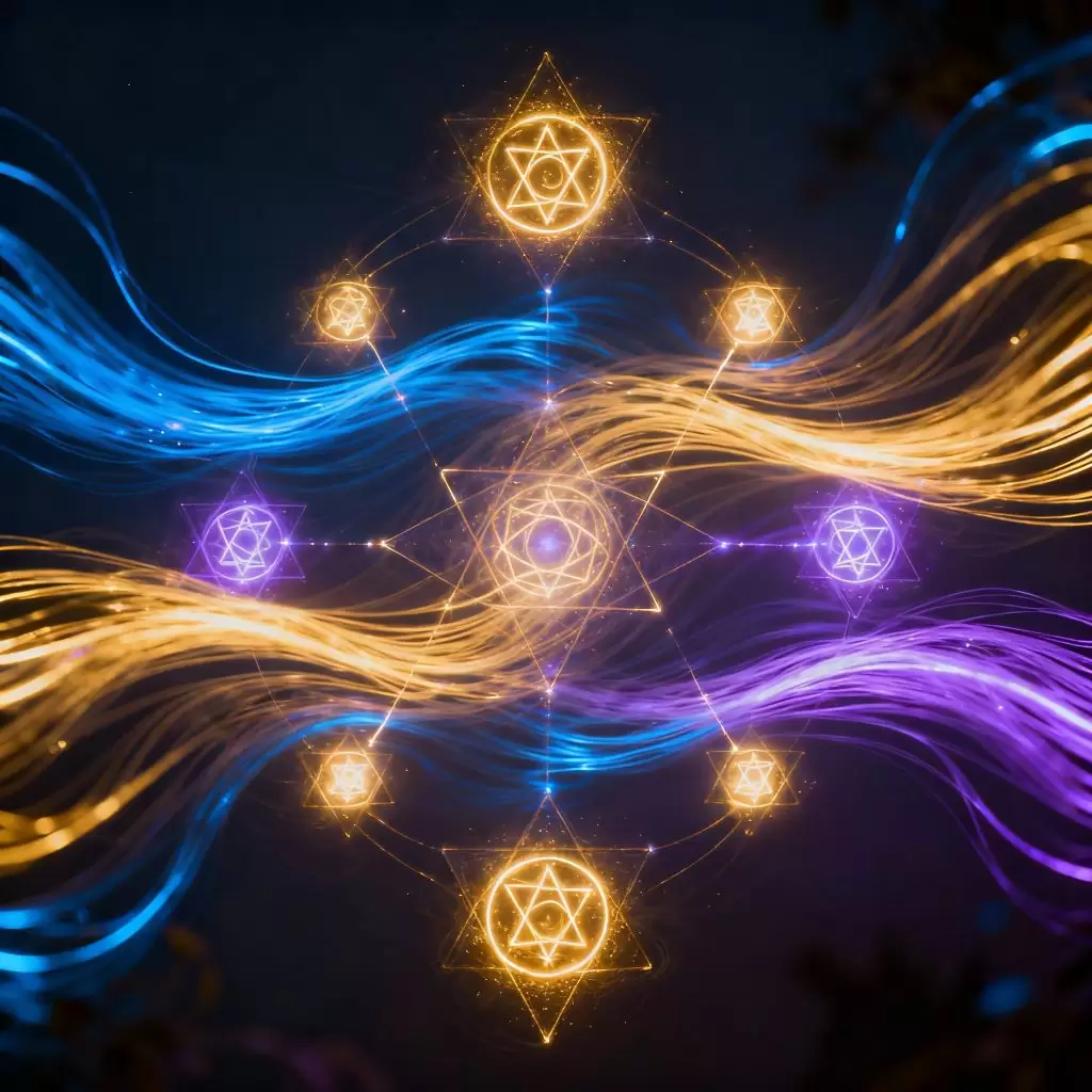
Every designer, whether knowingly or not, practices a subtle kind of alchemy. When we create balance in a composition — a layout, a logo, a digital interface — we’re channeling forces much older than modern design theory. Balance is the invisible equilibrium that transforms chaos into clarity, much like how a sigil transforms intention into manifestation.
In visual design, balance is not merely an arrangement of shapes. It’s an energetic dialogue between elements — the way colors whisper to one another, how space breathes, and how every stroke aligns with purpose. A perfectly balanced layout feels alive because it speaks the language of the subconscious, where symbols and geometry dance in eternal rhythm.
What Is Balance in Design?
Balance in design is the distribution of visual weight across a space. It ensures that no element overwhelms another — every detail finds its rightful place. There are three main forms:
- Symmetrical balance, like a mandala or mirrored pattern, radiates serenity and order.
- Asymmetrical balance, more dynamic and modern, evokes movement while maintaining harmony.
- Radial balance, like ripples on water, expands energy outward from a central point.
Each of these layouts mirrors ancient symbols found in magical traditions — from Celtic knots to alchemical circles — proving that human beings have always sought harmony through form.

Energy Flow and the Eye’s Journey
A well-balanced design guides the viewer’s eye like a spell. It controls energy flow, ensuring that attention moves smoothly across the layout. This invisible current — designers call it visual hierarchy — is the same force occultists once described as the flow of intent within a sigil.
When your eye lands on a focal point, drifts through space, and returns in satisfaction, you’re witnessing visual magic in action.
Understanding the Sigil: A Symbol of Intention
A sigil is more than a symbol; it’s a vessel for intention. In ancient magic, sigils were drawn to encode desire, focus willpower, and connect the inner and outer worlds. Modern design, too, captures emotion and message through form — turning human thought into visible geometry.
Sigils in Ancient Magic and Modern Design
Ancient mystics used sigils to anchor thought into physical form. Today’s designers do something similar when crafting logos or layouts — distilling identity and intention into shape and balance. Think of the Apple logo, or the golden spiral in nature-inspired branding — these are modern sigils, charged not by ritual, but by meaning and emotion.

The Language of Symbols and Geometry
Both sigils and balanced layouts are fluent in the same tongue: geometry. Circles represent unity, triangles suggest direction or divinity, and squares ground energy into stability. The geometry of a balanced layout carries emotional resonance — it “feels right” because it vibrates with natural order.
The Alchemy Between Layout and Sigil Design
Balance is the meeting point between chaos and cosmos.
In both design and magic, it’s the invisible bridge that turns raw energy into beauty. When a layout achieves balance, it no longer feels like mere design — it becomes a sigil of intention, a living pattern that communicates something deeper than words.
Creating a composition, then, becomes a ritual act — aligning visuals with purpose, energy, and emotional resonance.
Sacred Geometry and Modern Aesthetics
Designers often channel sacred geometry unconsciously — through grids, proportions, and symmetry.
The Golden Ratio, Mandalas, and Divine Proportions are visual manifestations of universal harmony. Whether it’s a temple façade or a website grid, these structures mirror cosmic order — proof that beauty, balance, and spirit are forever intertwined.
Practical Ways to Design a Balanced Layout
While the theory of balance feels mystical, applying it is both intuitive and intentional. Think of your layout as an altar — each element has energy, weight, and purpose. To achieve equilibrium, you must feel how each piece affects the whole.
Using Contrast, Rhythm, and Spacing
Balance emerges from contrast. Light and dark, large and small, bold and delicate — these opposites harmonize when thoughtfully placed.
- Contrast draws the eye; spacing gives it room to rest.
- Rhythm ensures the design flows rather than fragments.
- Alignment anchors the entire layout, like ley lines in sacred land.
Designers who master these principles don’t just create visuals — they channel emotion.
When Imperfection Creates Harmony
True balance doesn’t mean perfect symmetry. In nature, balance often hides inside asymmetry — a tree’s branches, a shoreline, a human face.
In design, a touch of deliberate imperfection keeps energy alive.
This is wabi-sabi, the Japanese aesthetic of imperfect beauty — where harmony comes from authenticity, not control.
A slightly tilted image, an unexpected color — these “flaws” breathe soul into an otherwise sterile design.

Why Balance Feels Magical: The Psychology of Perception
Balance resonates so deeply because it speaks directly to the subconscious. The human mind craves order — not rigid uniformity, but the rhythm of natural harmony.
Subconscious Recognition of Order
Our brains are wired to seek balance in everything we see. When a layout is balanced, the mind relaxes; when it’s off-kilter, unease arises.
That’s why balanced designs feel peaceful — they mirror the structure of nature, the orbits of planets, the proportions of the human body.
In a way, they remind us of cosmic order — the very essence of a sigil’s power.
Emotional Resonance and Energy Alignment
Emotionally, balance creates trust.
Viewers subconsciously sense stability, clarity, and calm in balanced designs.
It’s an energetic alignment — just like a sigil draws power from the harmony between thought and symbol, a layout draws beauty from the harmony between form and meaning.
Designing With Intention: Your Own Modern Sigil
When you design with awareness, every layout becomes a kind of sigil — a visual spell that conveys emotion, energy, and purpose.
Turning Layouts Into Living Symbols
Ask yourself: What is this layout trying to manifest?
Is it peace, creativity, excitement, or trust?
Once that intention is clear, allow it to guide choices — colors, spacing, alignment, contrast. Suddenly, every pixel begins to hum with coherence.
That’s the moment a layout transcends design — it becomes symbolic creation.
Examples from Art, Web Design, and Branding
- The Apple Logo: Minimal yet balanced, symbolizing innovation wrapped in simplicity.
- Mandala Art: Every circle and line radiates intention — a visual meditation.
- Zen Garden Design: Each stone and ripple of sand carefully placed to create serenity.
- Modern Websites: Grids that echo sacred geometry, where user experience feels like flow, not friction.
In all of these, balance becomes a quiet invocation — a spell for harmony.

FAQs About Balanced Layouts and Sigils
Q1. What makes a layout “balanced”?
A balanced layout distributes visual weight evenly, creating a sense of order and calm. It doesn’t have to be symmetrical — energy balance matters more than physical alignment.
Q2. Are sigils just spiritual symbols?
No. While sigils have mystical roots, modern interpretations view them as visual containers of intention — a form of symbolic design or creative meditation.
Q3. Can balance be achieved in minimal design?
Absolutely. Minimalism thrives on balance. The careful use of space and proportion gives minimal designs their serene, almost sacred presence.
Q4. How can I make my design feel more “alive”?
Introduce rhythm and slight asymmetry. Energy flows better when your layout feels organic, not mechanical.
Q5. What’s the link between sacred geometry and modern design?
Sacred geometry provides timeless templates of proportion and symmetry that inform everything from architecture to UI design. It’s where divine order meets visual structure.
Q6. Is balance a science or an art?
It’s both. Science defines its structure; art breathes soul into it. True balance unites the logical and the intuitive — just like a perfect sigil.
Conclusion: The Art of Balance Is the Art of Magic
In the end, a balanced layout is like a perfect sigil because both harness the same universal law: harmony through intention.
When you design with awareness — placing every shape, color, and space with purpose — you create more than visuals. You craft energy, emotion, and meaning.
Every balanced composition whispers the same ancient truth:
“What is within is reflected without.”
The designer becomes the modern magician — not of spells, but of symbols.
Through balance, we don’t just design what looks good; we design what feels right — and that, truly, is the most powerful magic of all.
External Link for Further Reading
For an in-depth exploration of geometry and harmony in design, check out Smashing Magazine’s Guide to Visual Balance in Design.

