Sacred Geometry and Modern UX: The Hidden Rules That Make Designs Feel ‘Right’ (Pentagramified Blog Series)
Introduction: When Math Meets Emotion in Design
There’s something mesmerizing about a design that just feels right. It’s not only about the colors, typography, or content—it’s about balance, proportion, and flow. Behind that invisible harmony lies a centuries-old principle: Sacred Geometry.
In today’s world of digital interfaces, this ancient philosophy subtly guides user experiences (UX), shaping how we perceive beauty, trust, and functionality. The intersection of Sacred Geometry and Modern UX reveals that great design is less about luck and more about universal mathematical truths.
The Timeless Allure of Sacred Geometry
From Pyramids to Pixels: A Brief History of Sacred Geometry in Art and Architecture
Long before Photoshop or Figma, ancient civilizations used geometry as a language of divinity and balance. The Egyptians built pyramids with precise angular ratios, the Greeks constructed temples based on the Golden Ratio (1.618), and Leonardo da Vinci captured the same proportions in the Vitruvian Man.
Today, those same geometric truths resurface—this time in app interfaces, logo designs, and website layouts.
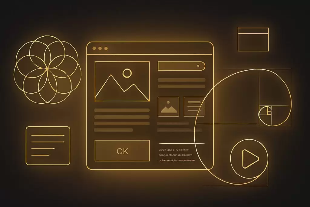
The Golden Ratio and the Fibonacci Sequence: Nature’s Blueprint for Balance
The Golden Ratio isn’t just a math equation—it’s nature’s fingerprint. You see it in nautilus shells, sunflowers, and even galaxies. When designers use this ratio in layouts, users subconsciously sense the harmony of nature itself.
That’s why Modern UX Design often follows these proportions to evoke calmness, familiarity, and visual satisfaction.

Understanding Sacred Geometry in Design Language
Core Principles: Proportion, Harmony, and Symmetry
Sacred Geometry thrives on three foundations: proportion, harmony, and symmetry. These elements dictate how users perceive order and balance. A layout that respects these principles feels natural, predictable, and beautiful—exactly what a user wants.
The Geometry of Emotion: Why Certain Shapes Evoke Specific Feelings
- Circles represent unity, trust, and connection.
- Triangles symbolize strength and direction.
- Squares convey stability and structure.
- Spirals represent growth and evolution.
Designers unknowingly use these emotional cues every day in icons, buttons, and navigation flows.
Circles, Triangles, and Spirals: Hidden Meaning Behind Common UX Patterns
When apps use rounded corners or circular icons, it’s not just for aesthetics—it’s because our brains associate smooth shapes with safety. This subconscious geometry fuels emotional resonance and enhances user comfort.
The Hidden Bridge: How Sacred Geometry Influences Modern UX Design
The Grid System: A Digital Expression of Ancient Proportion
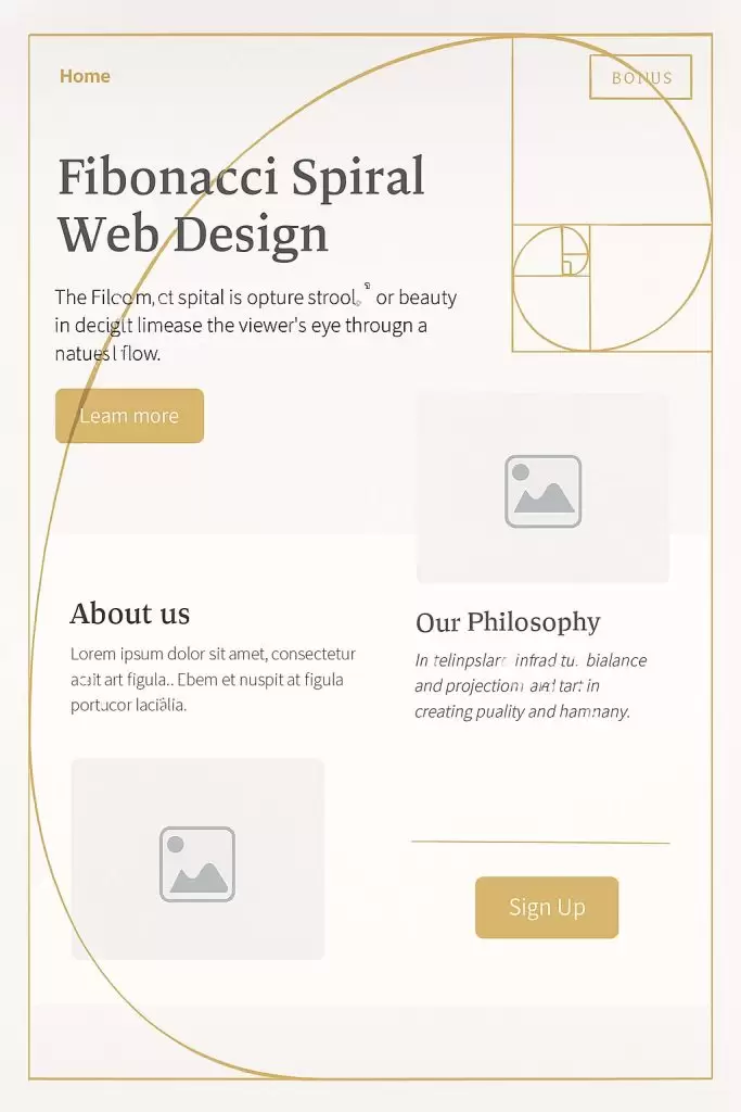
Grids are the backbone of UX. From the Fibonacci grid in photography to responsive web grids, these systems embody the harmony of Sacred Geometry. They help create rhythm and visual stability, making digital spaces feel balanced.
Balance, Spacing, and Flow: The Fibonacci Sequence in Interface Layouts
Designers often use Fibonacci spacing (1, 2, 3, 5, 8, 13…) to determine padding, margins, and hierarchy. This sequence leads the eye effortlessly through content—something users feel intuitively.
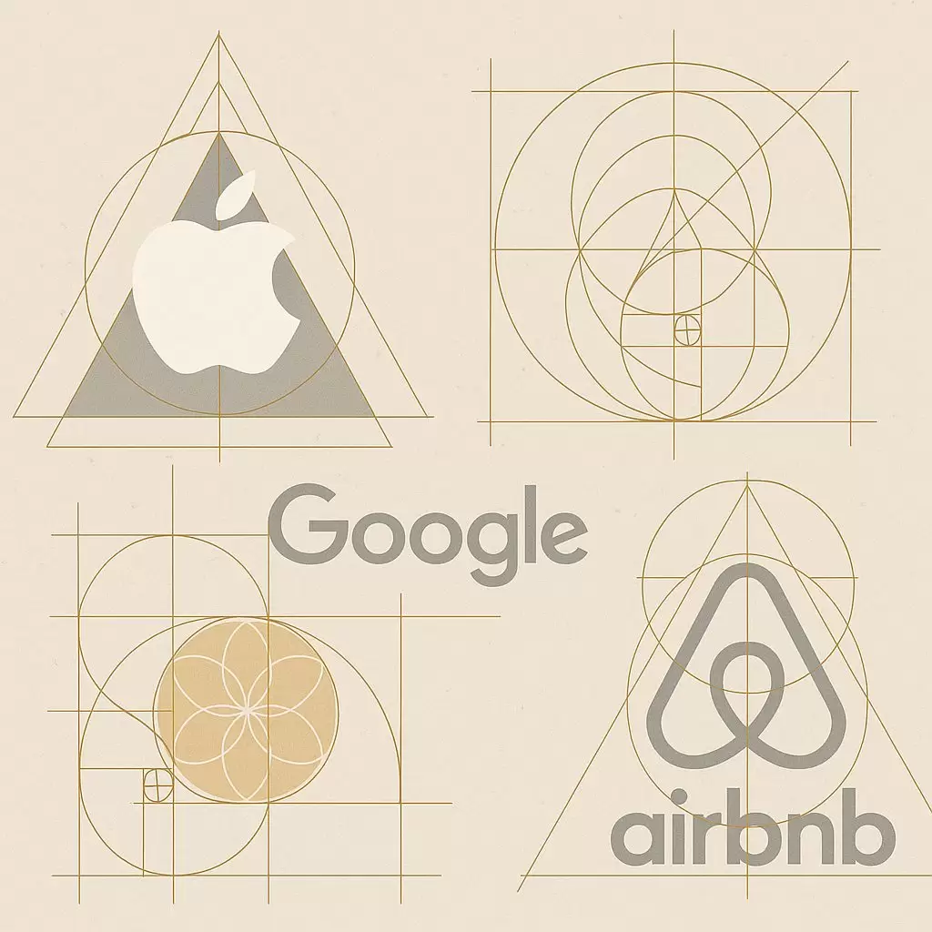
Examples from Top Brands: Apple, Google, and Airbnb
- Apple uses symmetry and golden ratio grids in its icons.
- Google’s Material Design is rooted in geometric balance.
- Airbnb’s Bélo logo blends circles and triangles to represent belonging.
These aren’t coincidences—they’re the result of geometry meeting psychology.
Visual Harmony and User Psychology
How the Mind Perceives “Rightness” Through Geometry
Human brains are wired to recognize patterns. When something aligns with universal geometric ratios, it activates our brain’s “reward” centers. This explains why we find certain designs aesthetically satisfying.
The Neuroscience of Aesthetic Pleasure in Design
Neuroaesthetics—the science of how beauty affects the brain—reveals that geometric symmetry reduces cognitive load. In other words, geometry helps our brains process information faster and more pleasantly.
Gestalt Principles and Sacred Geometry: The Overlap
Gestalt psychology explains how humans perceive visual elements as unified wholes. Interestingly, these principles mirror sacred geometrical ideas of unity and interconnection.
Applying Sacred Geometry in UX Practice
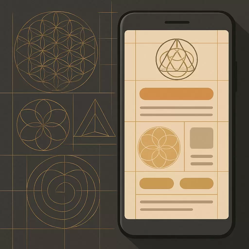
Using the Golden Ratio in Grids, Logos, and Icons
Designers can apply the Golden Ratio by:
- Using 1:1.618 proportions for layouts.
- Designing icons based on circular geometry.
- Structuring content using Fibonacci-based spacing.
Aligning User Flows with Natural Rhythms
User flows designed around rhythmic spacing mimic how our brains prefer to navigate space. The smoother the rhythm, the more intuitive the experience.
Practical Tools and Plugins for Designers
Tools like Golden Ratio Calculator, PhiMatrix, and Griddify make applying these principles easier. Many UX designers also use Figma plugins to create Fibonacci-based grids automatically.
Case Studies: When Sacred Geometry Meets Digital Products
Apple’s Minimalist Harmony
Apple’s brand thrives on geometric discipline. Its logos, devices, and interfaces are all built using precise ratios and symmetry. That’s why their products feel intuitively elegant.
Google’s Material Design Geometry
Google’s Material Design guidelines enforce strict spatial and proportional rules—essentially a modern evolution of sacred geometry.
Airbnb’s “Bélo” Logo: The Geometry of Belonging
Airbnb’s logo combines geometric perfection with emotional resonance, representing both connection and symmetry.
The Future of UX: Merging Data and Sacred Proportion
AI, Generative Design, and Geometric Harmony
With AI-driven design, machines can now analyze user behavior and create interfaces that follow natural geometric harmony automatically.
Why the Future of UX May Be Rooted in Ancient Principles
As digital environments grow more complex, the key to intuitive design may lie in returning to nature’s rules—those same sacred geometries that have guided art and architecture for millennia.
FAQs About Sacred Geometry and Modern UX
Q1: What is Sacred Geometry in simple terms?
A: It’s the study of geometric patterns found in nature and art that symbolize harmony and proportion.
Q2: How does Sacred Geometry apply to UX design?
A: UX designers use its principles to create layouts that feel balanced and naturally pleasing to users.
Q3: Why do humans respond positively to geometric designs?
A: Because our brains are wired to recognize patterns and symmetry, which feel inherently satisfying.
Q4: What is the Golden Ratio used for in UX?
A: It helps structure page layouts, icons, and visual hierarchies to align with natural visual balance.
Q5: Are there tools to help apply Sacred Geometry in design?
A: Yes—tools like PhiMatrix, Figma Ratio Grids, and Golden Ratio Calculator.
Q6: Is Sacred Geometry just aesthetic, or does it affect usability?
A: Both—it improves usability by aligning designs with the way humans naturally perceive order.
Conclusion: Rediscovering the Beauty of Order in Chaos
In a world obsessed with innovation, the secret to truly human design might actually be ancient. Sacred Geometry and Modern UX remind us that beauty, balance, and usability are timeless. When designers align their creations with the geometry of nature, users don’t just see harmony—they feel it.
For more insights into design psychology, check out Interaction Design Foundation—a great resource for exploring the science behind user experience.