Contrast and Chaos: How to Use Darkness to Highlight Light in Design (Pentagramified Blog Series)
Introduction: The Power of Contrast in Design
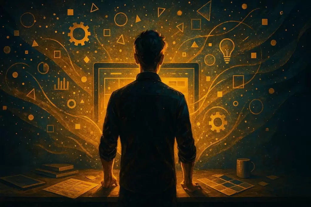
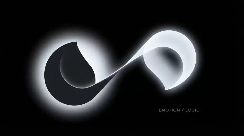
Contrast is one of the most fundamental principles of design — and yet, it’s often misunderstood. Many believe contrast is simply about opposites, like black and white, or light and shadow. But in truth, contrast is about balance, tension, and storytelling.
Using darkness to highlight light is more than a visual technique — it’s a philosophical approach to design. Darkness provides the context that makes light meaningful. Without one, the other cannot exist. Great designers understand how to wield this duality to guide attention, evoke emotion, and create depth.
Whether you’re designing a website, a painting, a room, or a film scene, learning how to master the play between contrast and chaos will elevate your creative expression.
Understanding the Relationship Between Darkness and Light
The Psychology Behind Contrast
Light naturally draws the human eye. Our brains are hardwired to seek brightness because it symbolizes clarity, safety, and focus. Darkness, on the other hand, evokes curiosity and depth. Together, they create a dynamic balance that holds visual tension and emotional resonance.
Symbolism of Light and Darkness in Visual Culture
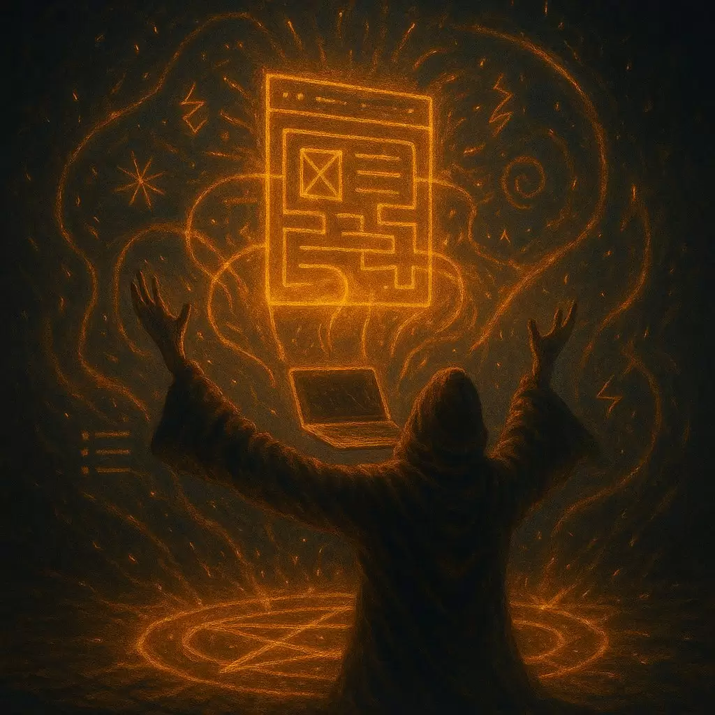
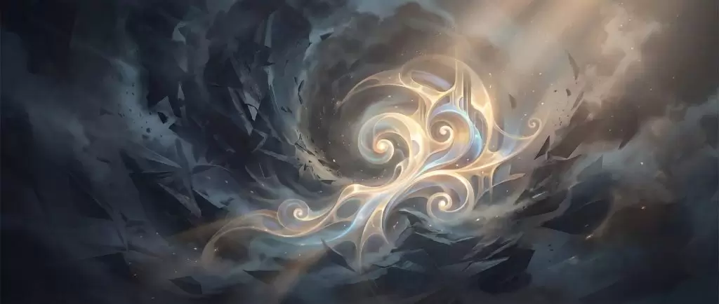
Throughout history, artists have used light and dark to symbolize knowledge versus ignorance, hope versus despair, and order versus chaos. In design, this symbolism continues — for example, a dark background can make a glowing logo appear more powerful and mysterious.
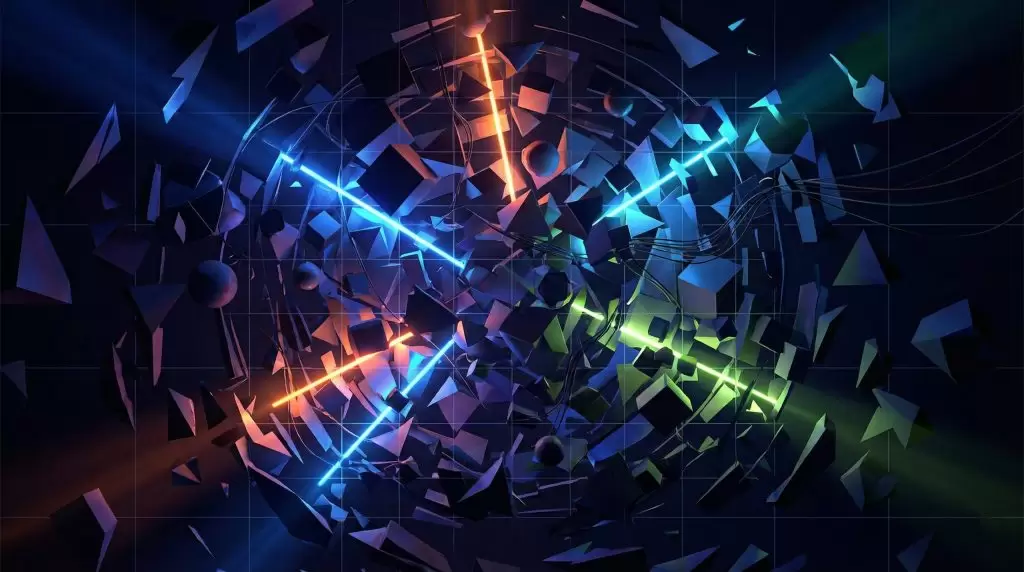
Why Chaos Enhances Beauty: Controlled Disorder in Art
Chaos in design doesn’t mean randomness. It means breaking symmetry just enough to spark intrigue. Designers who understand how to orchestrate visual chaos use it to emphasize order and calm where it matters most.
Balancing Asymmetry and Harmony
Perfect balance can sometimes feel static. By introducing controlled chaos — irregular spacing, varied contrast, or unexpected color gradients — you create movement and vitality in your composition.
Using Chaos to Draw the Eye
Chaos can act as a visual magnet. When paired with areas of clarity or brightness, it enhances focus. For example, a messy texture surrounding a clean white subject creates instant emphasis.
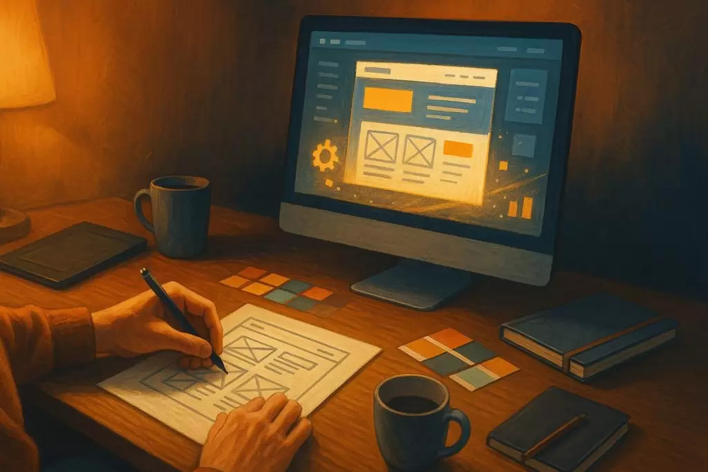
Techniques to Use Darkness to Highlight Light in Design
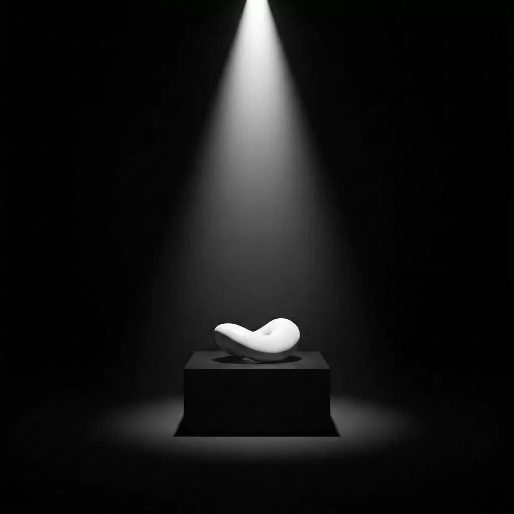
1. Negative Space and Minimalism
Negative space is the silent hero of contrast. By leaving areas intentionally dark or empty, you let the illuminated portions shine. Think of a single white line on a black canvas — simple, but powerful.
2. Gradient Shadows and Layered Depth
Shadows aren’t just for realism. Layered gradients create dimension and can guide the eye across your design, simulating light movement.
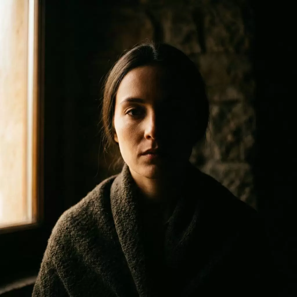
3. Dramatic Lighting and Mood Creation
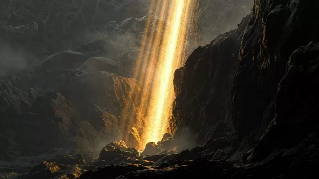
Cinematographers call this chiaroscuro — the art of dramatic light contrast. Using spotlight effects or vignette darkness can add mystery, intimacy, or suspense.
4. Dark Color Palettes for Emotional Resonance
Dark tones — navy, charcoal, plum — give a design sophistication and depth. Pairing these with subtle light highlights creates a luxurious and immersive effect.
5. Typography Contrast: Bold vs. Subtle
Contrast applies not only to color but also to form and weight. Combining bold type with delicate fonts or bright accents with subdued tones enhances readability and aesthetic appeal.
Real-World Examples of Light and Dark Mastery
Film and Photography: Caravaggio to Cinematic Noir
Caravaggio revolutionized painting by letting darkness tell half the story. Modern cinematographers continue this tradition, using light as a narrative tool.
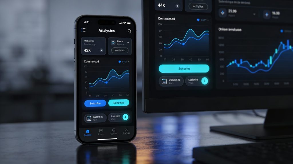
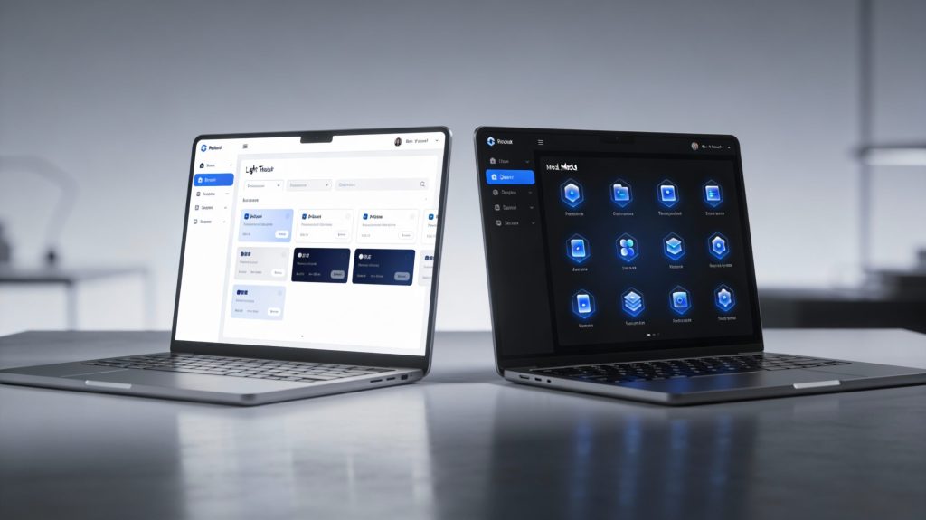
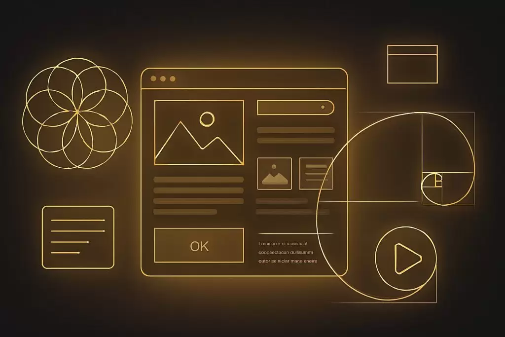
UI/UX Design: Dark Mode and User Engagement
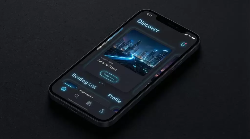
Dark mode isn’t just a trend — it’s a study in contrast. By reducing glare and highlighting key elements, it keeps users focused and visually comfortable.
Interior Design: Shadow Play and Texture
Interior designers use contrast by layering lighting — ambient, task, and accent — to define mood and dimension within a space.
The Emotional Impact of Contrast: Storytelling Through Design
Designing for Emotion and Focus
Light attracts. Darkness isolates. Using both strategically allows you to control where attention lands — a crucial aspect of visual storytelling.
The Role of Mystery and Discovery
Darkness invites exploration. When portions of your design remain hidden, it encourages the viewer to engage more deeply, creating a sense of mystery and discovery.
Common Mistakes When Using Darkness in Design
- Overpowering Light Sources: Too much brightness ruins balance and creates eye strain.
- Lack of Depth and Texture: Flat blacks can feel lifeless — use gradients or textures to add depth.
- Misusing Contrast Ratios: Poor contrast can hinder readability, especially in UI design. Always test accessibility standards.
FAQs
Q1. Why is contrast important in design?
Because it creates visual hierarchy, guides attention, and adds emotional depth.
Q2. How can I use darkness effectively in web design?
Use dark backgrounds with selective highlights to emphasize calls-to-action and readability.
Q3. What colors pair best with dark themes?
Soft neutrals, metallics, and subtle accent hues like gold, teal, or coral.
Q4. Is minimalism connected to darkness and light?
Yes. Minimalism uses space and contrast to focus on what truly matters.
Q5. How can contrast improve storytelling?
It reflects real-life tension — conflict and resolution — making your design emotionally engaging.
Q6. Can too much contrast be bad?
Yes. Extreme contrast can feel harsh. Aim for balance and intentional focus.
Conclusion: Finding Harmony in Chaos
Design is the art of balance — between order and disorder, clarity and ambiguity, light and darkness.
Using darkness to highlight light isn’t just about color theory — it’s about emotion, meaning, and storytelling. By embracing chaos and contrast, you create designs that speak to both the eye and the soul.
🌐 External Resource:
Learn more about contrast principles at Adobe Design Blog.